Compass Cycle
From idea to finished mark.
The process deck below provides a good example of how an concept goes from an initial idea to a full fleshed out mark.


Spark The Arts
All it takes is a spark.
Trinity United Methodist Church is the oldest church in Denver. But Senior Pastor Ken Brown believes that new ideas can welcome the community in ways that are far from the traditional view of church spaces.
That’s how Spark The Arts came to be. A half day of music enrichment for an under privileged Denver school. Drums were banged, shakers were shook, and 90+ kids walked away with a spark of music inspiration that will fuel their spirits for years to come.
Design work included the logo/branding, tagline creation, stickers, branded draw string bags, certificates and more.
At one point, a music instructor looked at the logo and asked, “Is this a nation wide organization? This branding looks legit.”


Safe Harbor
Sometimes all you need is a logo refresh, not a complete rebrand.
Safe Harbor was seeking a new mark for their insurance brand. The phrase “Safe Harbor” didn’t exactly line up with their existing logomark which featured a sailboat. After settling on an iconic lighthouse as the key visual, the only thing left was an execution that stayed simple and had fun.


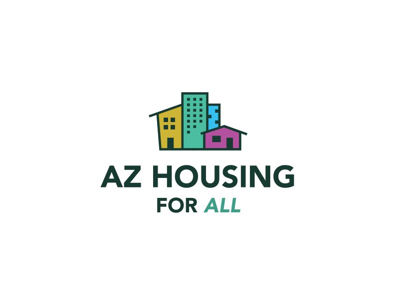
AZ Housing For All
A mark that says “housing” not “house”.
Arizona is one of the fastest growing states in the country. And with that growth comes the need for more housing. When the housing crisis hit the county, AZ Housing for all stepped into action, and they needed a logo mark that could represent all of their constituents, not just single family homes.
The task was to create a lone mark that spoke to a wide range of housing options that AZ Housing was advocating for.


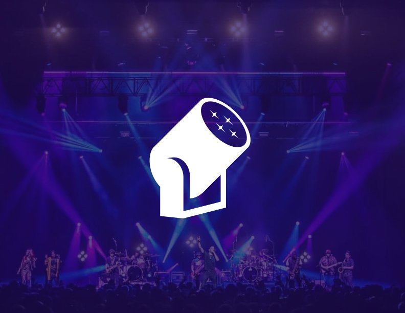
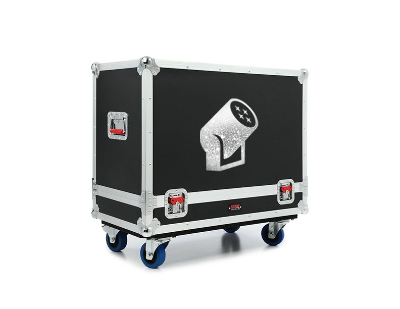
Pulse Lighting
A killer mark for some killer light shows.
I met Paul and Preston Hoffman, co-founders of Pulse Lighting back in 2010. They were already creating light shows for some iconic bands and events. But up until that point, they didn’t have a recognizable logo mark. The iconic shape of a light can provided the perfect visual element to represent Pulse’s brand, which has gone on to produce light shows for the top names in entertainment.


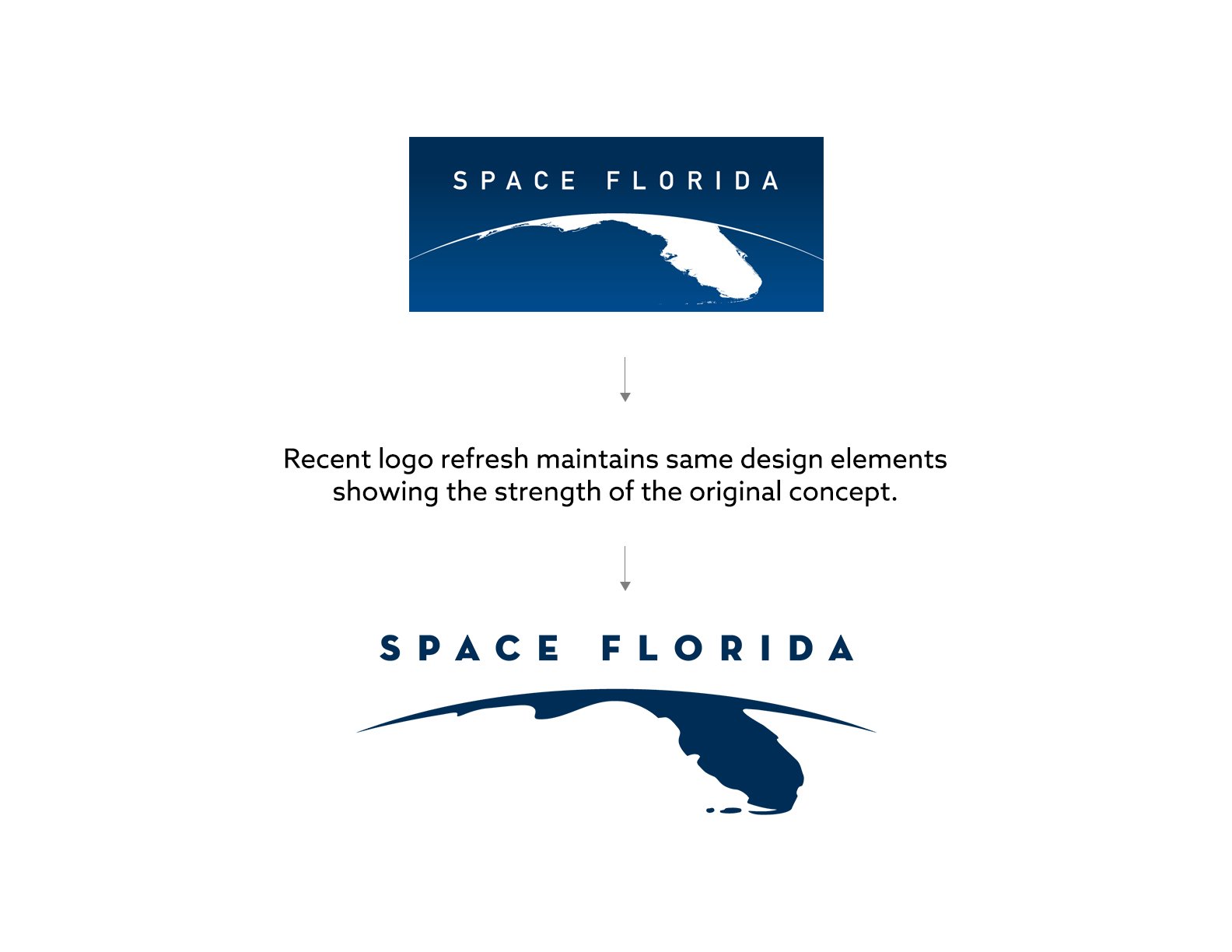
Space Florida
Centering Florida in the new space race.
In 2011 when the NASA Space Shuttle program ended, a new race began. Soon, dozens of companies we’re vying to sercure billions in government contracts to provide extra-terrestrial transit of cargo and eventually humans.
One of those companies was Space Florida who were looking for a logo mark that would literally put them front and center amongst the competition.
The end result was a mark that was inspired by the iconic aerial images of the Space Shuttle lifting off, defying gravity, and leaving the horizon far behind.
In a testament to the strength of this iconic mark, when Space Florida refreshed its mark, the key visual element was maintained only updating the font and simplifying the state outline.


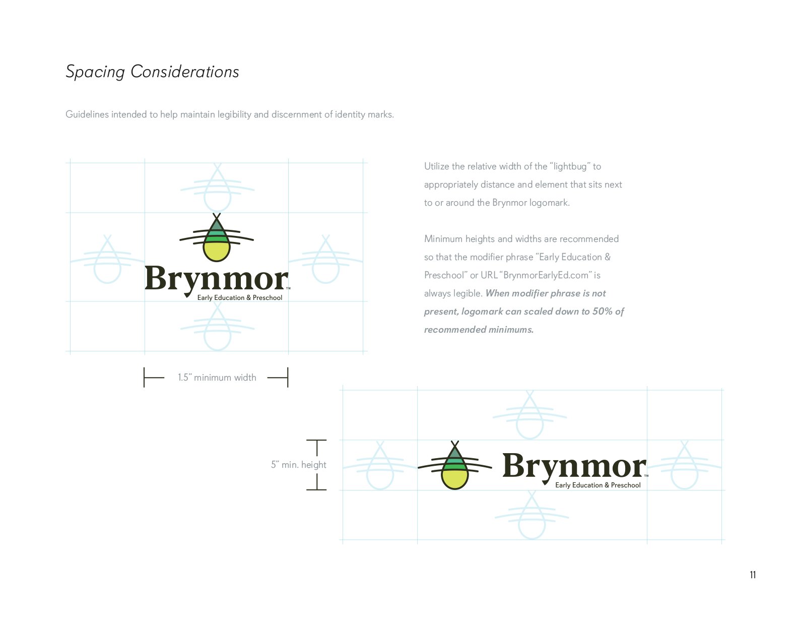
Brynmor
A new brand for a new generation.
Brynmor is a new early childhood education facility in Lortan, VA. With grand plans to expand to other cities, Brynmor needed a highly iconic mark that merged the idea of enlightenment with youthful exuberance. Enter the “lightbug”. A graphic play on lightning bug and light blub, this mark captures the spirit of learning a an early age. The logo mark is paired with Blacker, a fresh font that also showcases “tradition” with its serif’d characteristics.


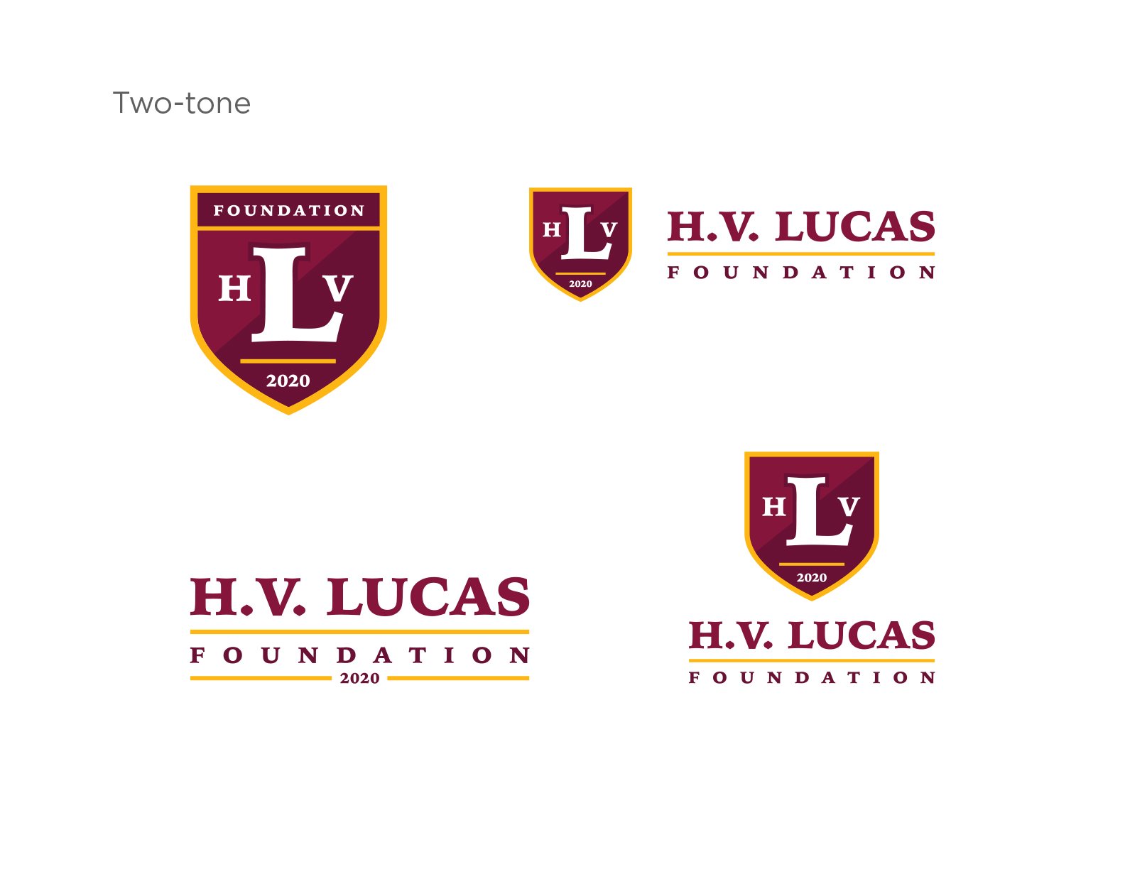
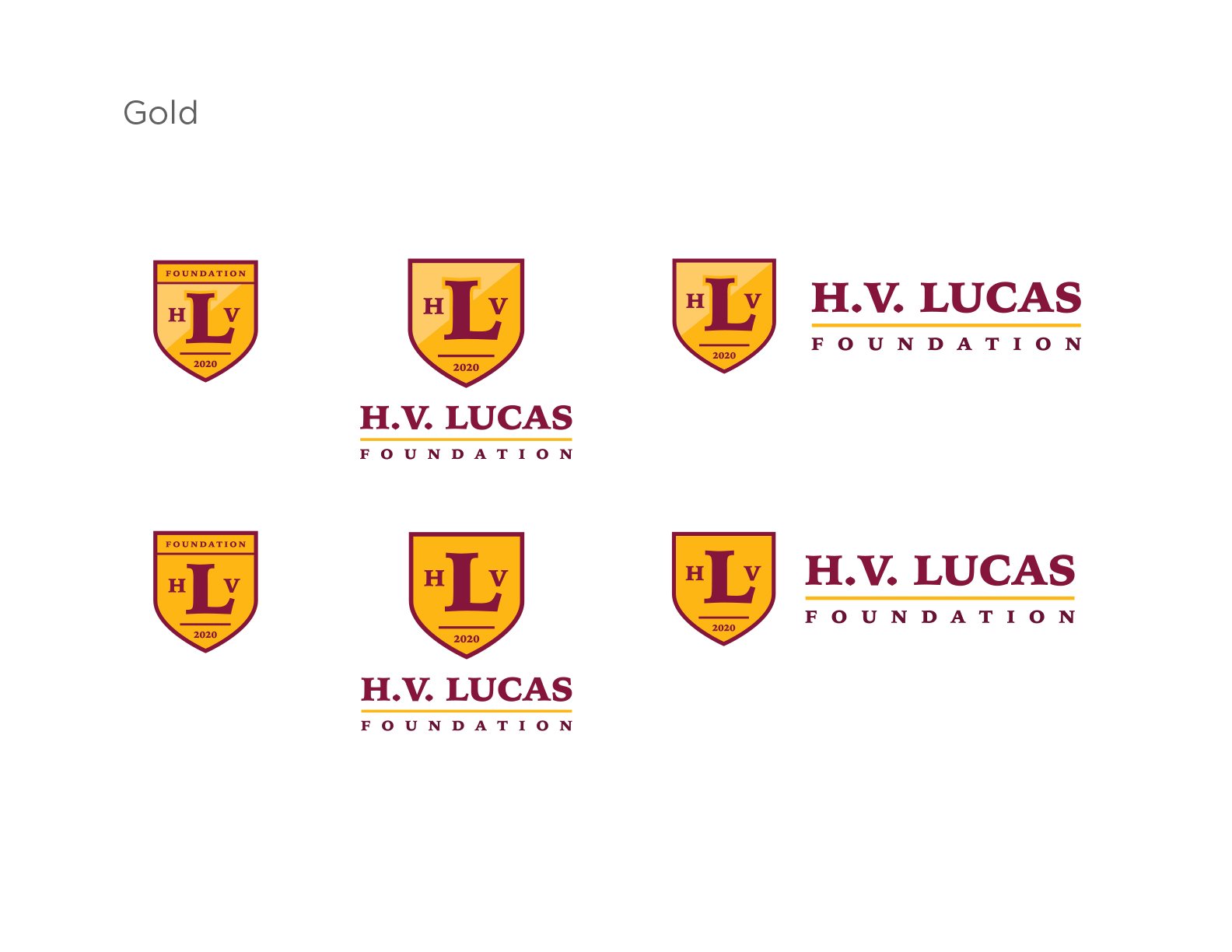
H. V. Lucas
Honoring the past with a logo that would continue a legacy.
Bethune-Cookman College is an HBCU in Daytona Beach, Florida with a storied past. Part of that story are the notable graduates who have carried their alma mater’s legacy with them for the rest of their lives. One of those individuals is Harold. V. Lucas who is a former student, athlete, and coach. His legacy looms large at B-CC as well as in the community of Daytona Beach. Creating a logo that exemplified his legacy and contributions was a top priority of Lucas’ family who were establishing a scholarship and foundation in his name.


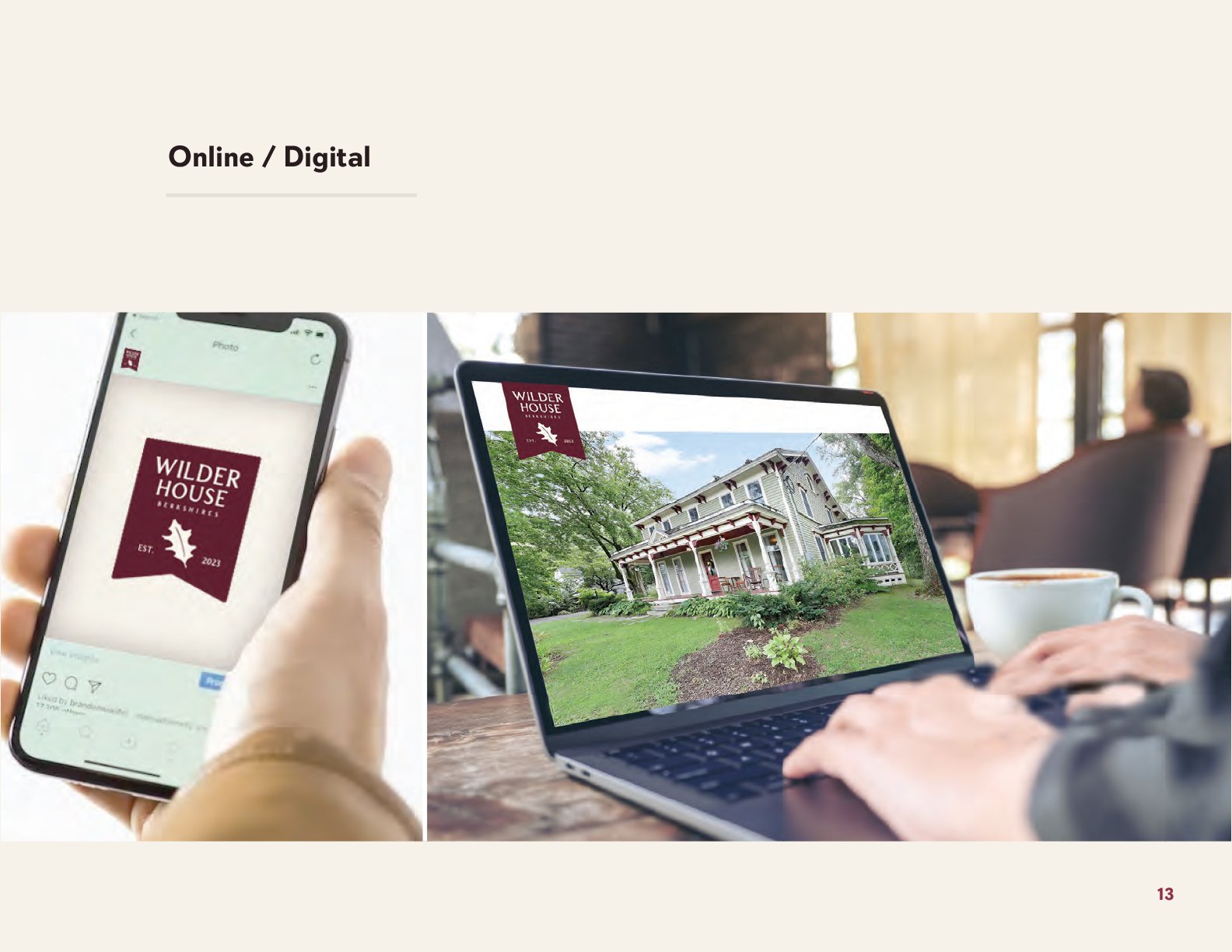
Wilder House
The Berkshires are calling.
Some of us dream of opening up an bed & breakfast in the Berkshires. I have an friend who did just that. And when it came time to develop a logomark and brand for his family’s new venture, I was the one he called. Lucky me.
The Berkshires are filled with B&B’s with cute names and vintage looking signage. So, it was important to stand out from the crowd with a mark that felt fresh but could also hang on a sign post as vacationers wandered down tree-lined country roads looking for an inn where they could rest their weary, leaf-peeping eyes.
Bed & breakfasts might feel like a relic from a bygone New England past. But to succeed in the age of Air-Bnb, one’s brand is a crucial part of your story. With this in mind a logo suite was created to provide the inn-owners a wide variety of branded elements that could adorn the many accoutrements that you are sure to find during your stay at the Wilder House.


See Mike Dunn
A vintage-inspired logo for the modern game.
Mike Dunn is an elite basketball shooting coach and trainer who has worked with thousands of athletes included NBA and NCAA players. At the highest level, success and failure can come down to slight variations in one’s shooting form. With surgical precision, Mike Dunn is able to identify problematic techniques that are holding back a players full potential on the court.
Mike leads camps, conducts seminars, provides subscription services, and releases downloads, all of which needed consistent branding that would allow the brand to be recognized and grow.
The See Mike Dunn logomark honors the timeless feel of old sports brand logos like Spalding.


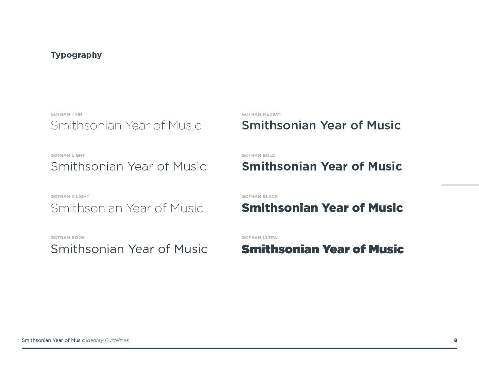
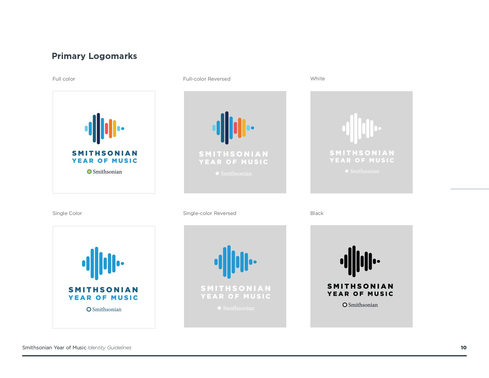
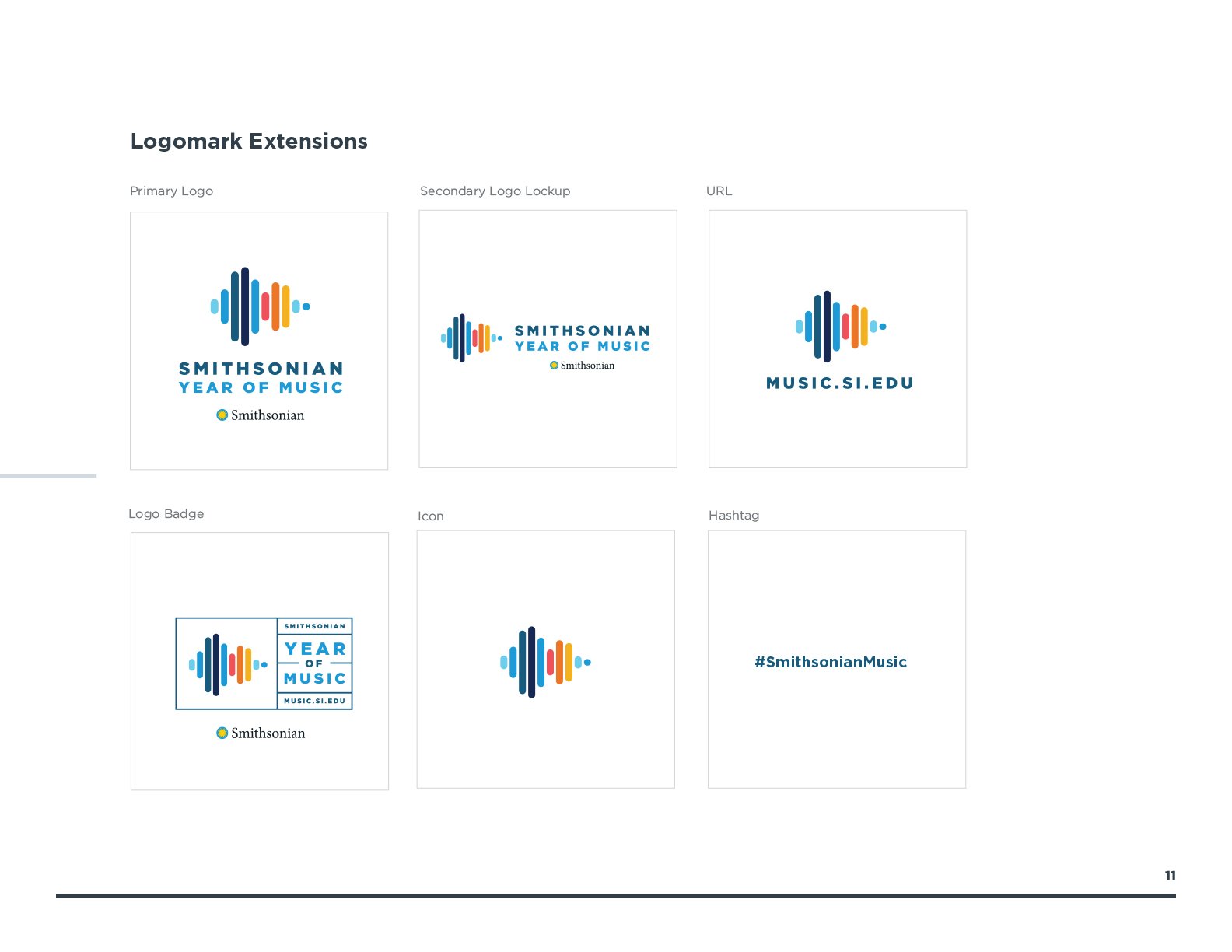
Smithsonian Year Of Music
Turning audio into an iconic logomark.
The Smithsonian has the worlds largest music complex. To celebrate, the Smithsonian Year Of Music was envisioned. Spanning an entire year, the cultural institution would program music events highlighting their music label as well as the millions of artifacts that were in their archives. A program this large would need a brand identity that could serve as a touch stone across a wide variety of events, lectures, and exhibitions.
This project was no small endeavor. The Smithsonian is a world renown cultural institution and the Year Of Music called for an iconic mark. After many sketches and executions, I began to think of more conceptual solutions that would rise to the level of the Smithsonian brand and reputation.
Sound waves was certainly a solid idea, but going deeper I wanted some meaning to be embedded in that sound wave. Using a simple voice recorder, I recorded me saying the word “music”. I then took the graphic representation of that sound wave and abstracted it into a simple set of bars that still resembled a sound wave. When I presented this solution to the client, they simply said, “This solution feels very “Smithsonian””. And that was all the validation I needed for this logo creation.


Listen Local First
Branding a local music initiative.
I lived in Washington, D.C. from 2006-2012. It was one of the most formative time periods of my life. It was also the time in my life when I started to pursuit my passion for songwriting. A big part of being a working songwriter is finding opportunities for you to play. One day I was sitting in a coffee shop who prided themselves on being “all-local”. Locally roasted beans, locally founded, local art on the walls. But I noticed that they were playing top-40 music over their speakers. This felt like a disconnect. They call themselves local, but when it came to the music they played, it was decidedly un-local.
So, I pitched an idea to a music-lawyer friend of mine. We needed to get local establishments to feature local music in their stores, therefore elevating the local music scene in the city. This is was the impetus behind “Listen Local First”, a local music initiative that provided local music playlists to establishments so that they could play and support the local music scene.
The logo came about pretty quickly, riffing off D.C.’s “Think Local First” business association, who was our fiscal sponsor throughout the endeavor. Listen Local First is still going strong, but has shifted its focus to addressing the many policy decisions in D.C. that affect the local music scene.


Bike Snowmass
Off-season slopes get a new life, and a new brand.
Skiing is big business in Colorado. But for 6 months out of the year, the slopes are nothing but grassy mountainsides waiting for the first snowfall to invite skiers back. To maximize profits and tap into the ever-growing recreational mountain biking population, many ski resorts have invested millions into converting some of their ski slopes into downhill bike parks, providing a new ground for bikers to explore and activating a time of year that resorts have considered the “off-season”.
When it was time for Snowmass Mountain to grab a piece of this growing market, they needed a brand that would convince their avid skiers to come back during the summer months, albeit with a different set of equipment… their bikes!
With soaring vistas and iconic mountain ranges, it was important to combine a geographic feature with an iconic cycling symbol, the gear. This new logo would need to work on way-finding signage as well as a sticker on your favorite Nalgene bottle.

Plantitas
A new brand for a hobby that outgrew its pot.
In 2020, during the height of the pandemic, most of us turned our attention and focus to the home. Home improvement projects skyrocketed and hobbies took off. And some of those hobbies turned into new ventures for many individual who were looking for a new, post-pandemic path.
Plantitas was a new venture that took a love of planting and gardening at home to online classes and eventually farmers markets around the city. The goal of this branding exercise was to create a logomark that was cute, humble, and alluded to the essence of the Talavera plant aesthetic in subtle ways.